
Edward Johnston and Eric Gill – The Two Typefaces of Britain
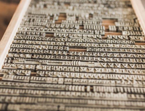
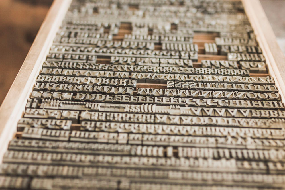
There are two terms that often get described as the same thing. Though this is untrue, a typeface is not a font which depicts the size and weight of letters and numbers. A typeface however is a letter and number design which is completely different in respect to designing visual text. Typeface is vitally important when designing any printed presentation. Historically, over the last century or so there are two typefaces which are ubiquitous throughout the UK and appear very frequently in every town and city. They are Johnston and Gill Sans. Typography is interesting because it can phase the emotion of the message and the importance and the meaning of the information presented. For example an advertisement for a funeral directors would not look appropriate if it appeared in a zany, comical typeface. Of course a more formal, sombre typeface would be much more suited for such a service.
One of the first problems with ununified coordination concerning typeface and signage to emerge in public life, can be traced to the development and expansion of the London Undergrown system in the early part of the 20th Century. Each new station had its platform walls plastered with the advertisements of many goods and services as well as the vitally important information for passengers and commuters which revealed which station they were actually at. The fact that there was no coordination between stations meant that the official signage was different at every stop. This made the rail network look unprofessional and disjointed.
A man named Frank Pick was responsible for managing the publicity and creating the brand image for London Underground at this time. It was decided that in order to create signage that would cover the entire network and be clearly identifiable as the official London Underground brand a typeface would be in ‘Sans-Serif’ rather than just ‘Serif’ which had been the case for the signage and advertising used so far. The difference between the two is that in typography if the lettering is ‘Serif’ a small line is attached to each letter or symbol. If this stroke is removed from the typeface, it then because ‘Sans serif’. This is derived from the French word sans which means without. The man commissioned to create the new Sans Serif typeface, for commercial printing use regarding the London Underground was a calligraphy expert and lecturer called Edward Johnson. He was identified by Pick as the creative and artistic individual who could be entrusted to complete the modernisation and rebranding required at the time. This calligrapher introduced the Sans style based on the Roman Square proportions of ancient times, focusing on narrow width strokes contains within each letter design. This new clear and bold lettering was introduced throughout the London Transport system in 1916 and was protected from use by any other organisation or business because the print firms contracted were forbidden to use the design text for anyone else.
This new typeface rebranding was a complete success for both London Underground and the London Bus networks. Standardisation of all signage and information soon led to the easily identifiable official information throughout the entire public transport network.
However, the evolution of another new typeface was soon to emerge from a former student of Johnston’s. His name was Eric Gill who was an architect and stone cutter in the early years of his career. It was while he was studying calligraphy that he became interested in developing a new Sans Serif alphabet. He did this by using relatively new method of printing technology at the time known as ‘casting’. This was now available on an industrial scale due to the success of a company called Monotype based in Surrey.
Although Gill’s new typeface was inspired by and similar to Johnston’s original, he added to it a new ‘Art Deco’ style. The difference between Johnston’s and Gill’s design was subtle and effective. Gill used more symmetry to letters and numbers and added slightly more curve to create a more stylish Roman or Trojan visual effect.
Monotype was now able to create text in many different sizes in large volumes due to the development of a machine called the Supercaster. They identified the ‘Gill Sans’ style as the new method. They needed a new customer to secure large contracts for widespread use. Fortunately for them the LNER (London North East Railway) wanted to rebrand at the time and Monotype secured the contract to provide the nameplate on the newest and speed record breaking iconic locomotives of the time which were the Mallard and the Flying Scotsman.
The new typeface broke from the confines of London to go nationwide and the Gill Sans print typeface was then applied to shop signs, timetables, information posters and even menus which were now printed with this new stylish typeface. It became ubiquitous throughout the country for information and advertising and is still used widely to this present day.
Blog by Simon Jones 27th August 2017
Photo by James Giddins on Unsplash


Hmm it looks like your site ate my first comment (it
was extremely long) so I guess I’ll just sum it up what I had written and say, I’m
thoroughly enjoying your blog. I as well am an aspiring blog
blogger but I’m still new to everything. Do you have any helpful hints for rookie blog
writers? I’d really appreciate it. http://coqulousbrainboost.net/